
Interior design · 2024
Vered Shitrit(01)
- Client
- Vered Shitrit
- Sector
- Interior design
- Year
- 2024
- Role
- Brand identity, Art direction, Web design, Development
The problem
An established interior designer with a substantial body of work and no digital presence that matched it. The work photographs beautifully; the problem was building a site that stayed out of its way and still read as considered.
Image · Johnny Ho
Decisions
Typography carries the brand, not a logo(01)
The identity is built on a refined type system rather than a mark. For a designer whose output is spatial and material, a typographic identity sits alongside the work instead of competing with it.
A muted earth palette, taken from the projects(02)
The palette was drawn from the interiors themselves so that every photograph looks native to the page. The site is a neutral container; the rooms supply the colour.
Photography direction as part of the build(03)
Image treatment, crop discipline and sequencing were set as part of the design rather than left to whatever was available, so the portfolio holds together as one body of work.
Screens
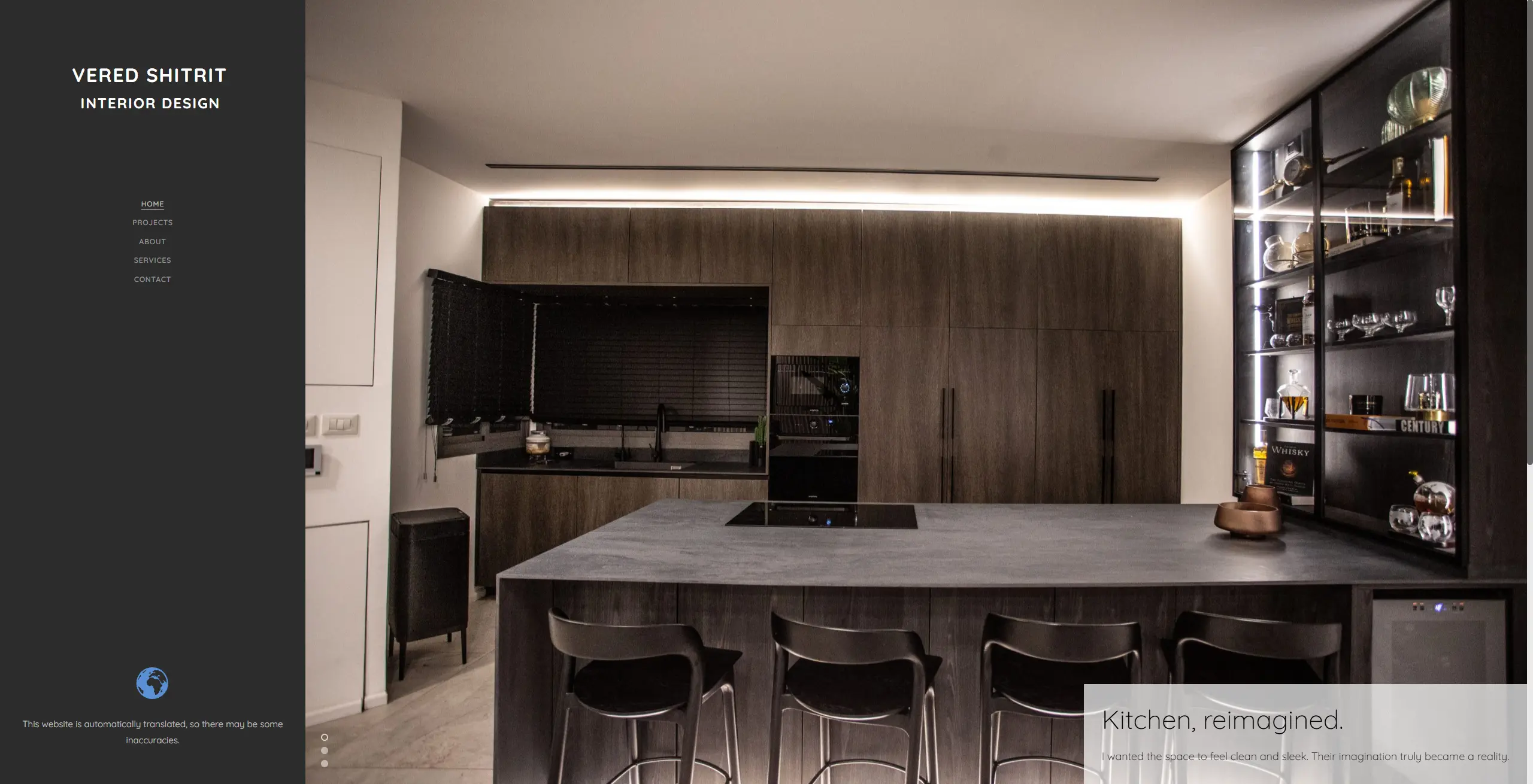
Screen (01)
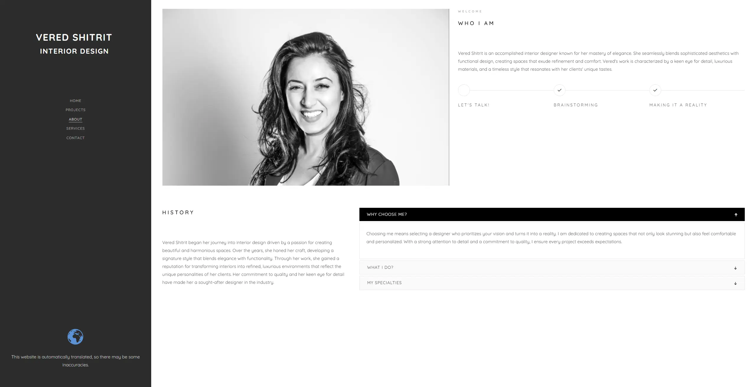
Screen (02)
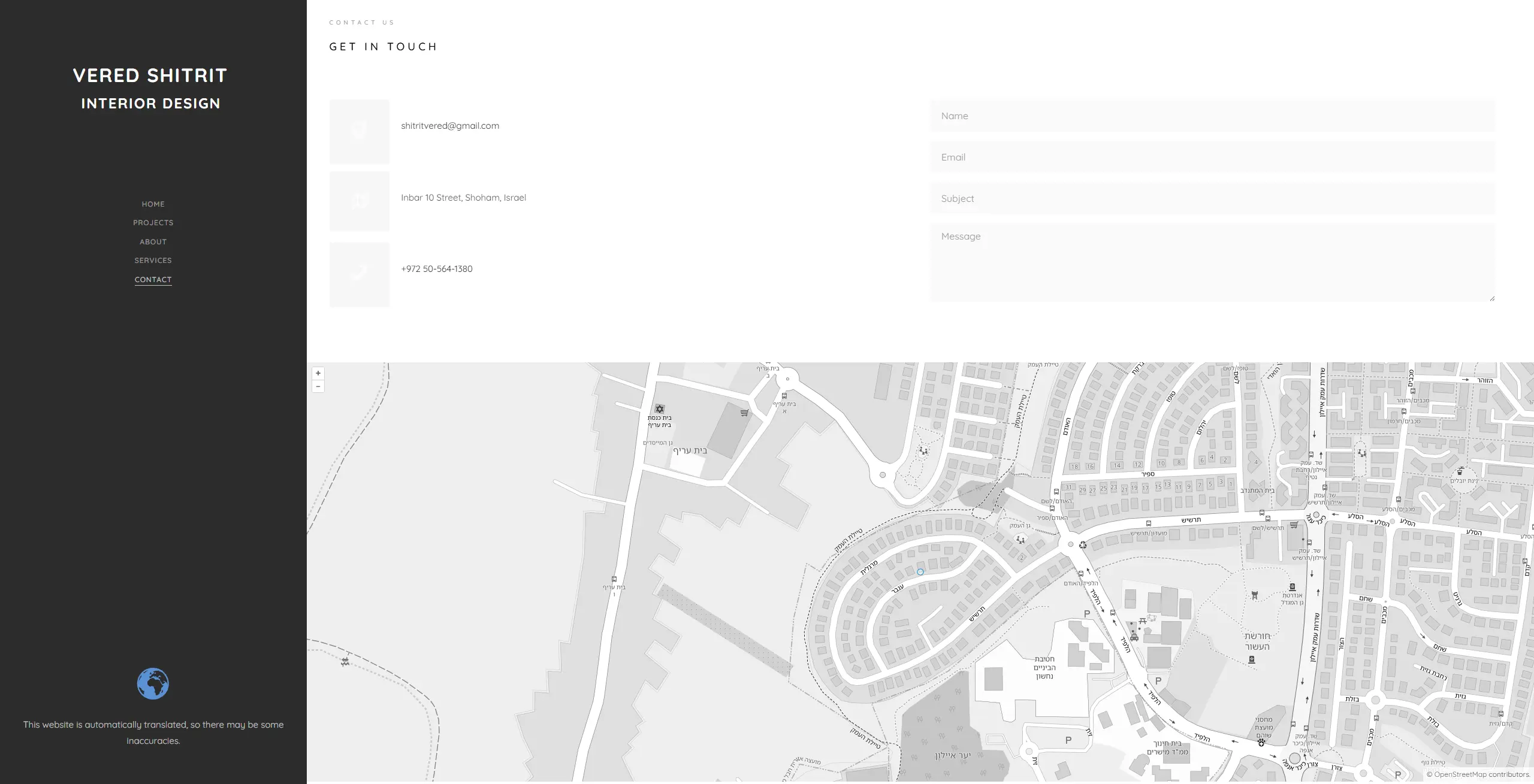
Screen (03)
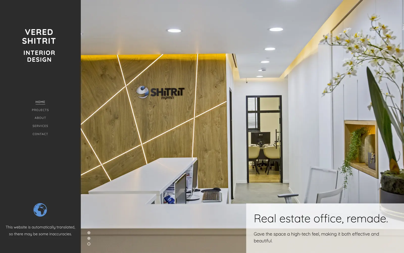
The site in full
(03)
Frame (01)
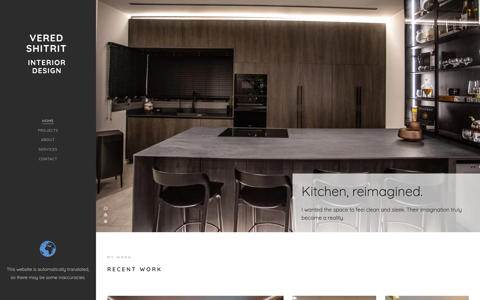
Frame (02)
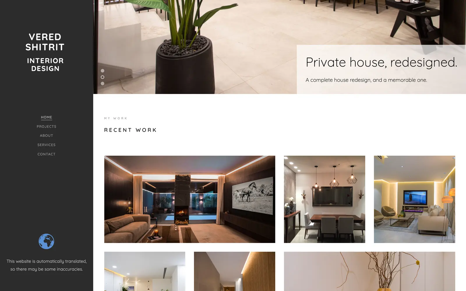
Frame (03)
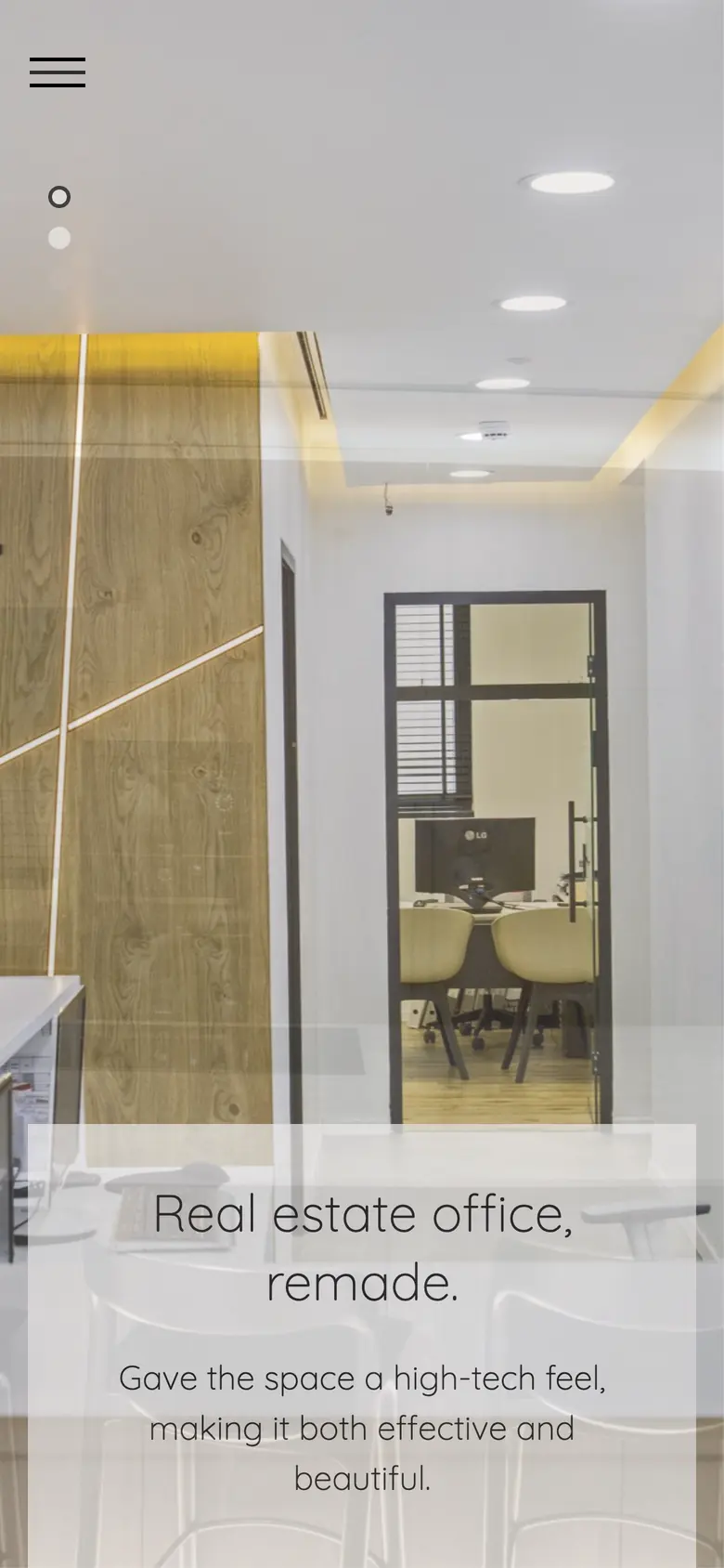
On a phone
390 × 844
Design system
Typeface
Quicksand · 300 / 400 / 500 / 700
Palette
- #ffffff
- Page
- #2c2c2c
- Chrome
- #000000
- Type
- #999999
- Secondary type
- #8a7342
- Sampled from the interiors
Measured, not described. The typeface is the computed font stack of elements on the live site, and the colours are computed CSS values. The one swatch marked as sampled was read from a photograph on the page.
Build notes
- Editorial layout system with a fixed grid and deliberate full-bleed breaks
- Image-led pages tuned so photography loads first and text never reflows

Designed and built for Vered Shitrit, 2024.
Every project here is a commission for one client, not a template with the names changed. Tell us what yours has to do.
Start a project