
Personal safety · 2024
ALRT(03)
- Client
- ALRT
- Sector
- Personal safety
- Platform
- iOS and Android app
- Year
- 2024
- Role
- Brand identity, Product design
The problem
An app whose entire value is one action taken in the worst possible conditions: badly lit, one-handed, panicked. Every design decision had to reduce the number of things a person must think about.
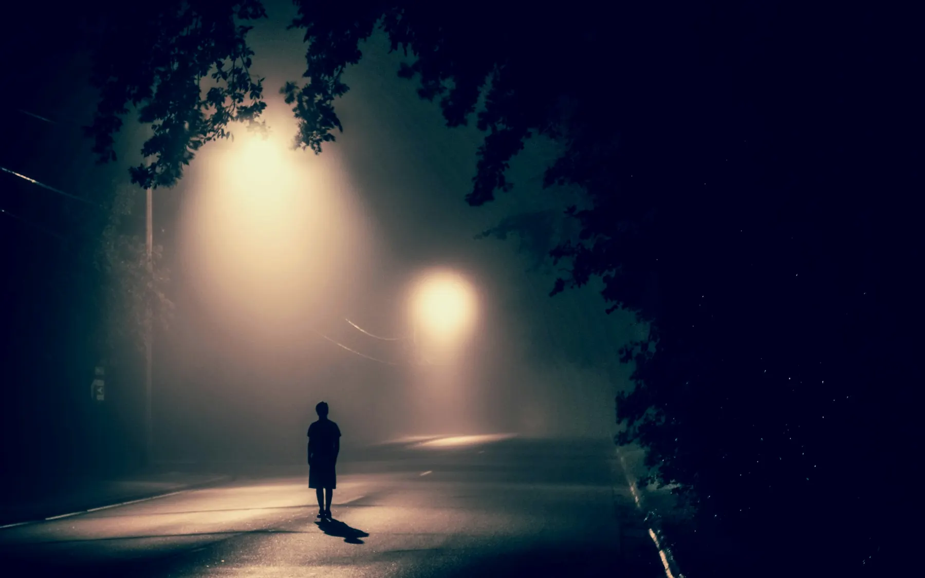
Image · Atharva Tulsi
Decisions
One action, no hierarchy to parse(01)
The interface was reduced until the primary action could not be confused with anything else on screen. Secondary functions were pushed out of the critical path entirely.
High-contrast system, chosen for legibility first(02)
The colour system was built for contrast and accessibility rather than for brand expression, so it holds up in poor light and for users with low vision.
Design system
Palette
- #101818
- Ground
- #182028
- Panel
- #6858e0
- Primary action
- #38d0c0
- Secondary action
Measured from the delivered screens. There is no live site to read computed styles from, and a typeface cannot be recovered from an image, so none is claimed.
No public link
ALRT is a mobile app, not a website — it is installed from the app stores, so there is no address to open and nothing here to embed. The delivered screens are not published either: the only exports we hold are from the design file with the data bindings unresolved, and a picture of an interface showing placeholder tokens is not a picture of the product. So this case study is its reasoning and its design system, which are the parts we can show honestly.
Designed and built for ALRT, 2024.
Every project here is a commission for one client, not a template with the names changed. Tell us what yours has to do.
Start a project